Analyzing Uplift Models
By Dvir Ben Or and Michael Kolomenkin
When it comes to real-world applications, a key concern lies in our ability to foresee the effects of different actions, or interventions, on an outcome variable. Uplift modeling is a domain in which models are used to estimate the change in outcome generated by a given treatment, on an individual level [1]. Such models are used to identify those instances that will be most impacted by treatment assignment, with respect to the outcome variable. These models can also be used to predict the optimal treatment based on given subject characteristics. This is also known as the personalized treatment selection problem [2,3].
Uplift modeling can be implemented across different domains. For example, in personalized medicine, it can be used to identify the patients who are most likely to benefit from medical treatment, as well as to assign the most suitable treatment to each patient. In the advertising industry, it can be used to select the e-mail message that will most significantly impact the click-through rate on a per-user level.
Although uplift models can rely on classical regression and classification modeling techniques, they pose unique challenges and cannot be evaluated using classical supervised-learning evaluation methods. In this post, we provide a formal description of the uplift modeling problem and demonstrate how to evaluate and describe the performance of such models.
The evaluation methods described in this post are implemented as part of a python package named uplift-analysis. The package is also used to create the visualizations presented in this post. Check out the tutorial for more demonstrations.
Notations & Formulation
Table 1 summarizes the components of a typical uplift modeling problem.
| Name | Notation | Description |
| Individual | The primary entity considered as part of the system | |
| Input context | \(\boldsymbol{x}\) | The features, attributes or any other representation associated with the individual |
| Treatment | \(t\) | The action assigned to the individual |
| Outcome | \(y\) | The response variable observed after treatment is assigned to an individual |
| Observation | \((\boldsymbol{x},t,y)\) | A single combination of input context, treatment and outcome observed as part of the collected data. |
| CATE – Conditional Average Treatment Effect | \( \tau \) | The expected effect of the treatment on the given individual |
| Uplift score | \(\hat{u}\) | The model output that is used to estimate CATE |
During the inference stage, an uplift model assigns a treatment to an individual according to the associated input context in order to maximize the Conditional Average Treatment Effect.
A treatment (used interchangeably with action) is chosen from a predefined set. A neutral treatment that indicates no-action is also a legitimate option.
The modeling stage typically starts with the acquisition of data. Each observation \((\boldsymbol{x},t,y)\) in the collected dataset consists of the context \(\boldsymbol{x}\), randomly assigned treatment \(t\), and the outcome \(y\) observed after the treatment is administered.
Below, we elaborate on the above notations.
Observation
Every observation in the collected dataset is represented as a tuple \((\boldsymbol{x},t,y)\), where:
- \(\boldsymbol{x} \in \mathbb{X}^d\) is the feature vector associated with the observations, often termed as the input context. The \(d\) random variables composing the feature space, \(\mathbb{X}^d\), can be either numeric or categorical.
- \(t\) indicates the treatment assigned to the observation. A neutral action is denoted as \(t_0\), and a set of \(K\) different non-neutral treatments is encoded as \(T=\{ 1,…,K \} \).
- \(y\) denotes the response (or outcome) variable, observed after assigning the treatment \(t\) to the context \(\boldsymbol{x}\).
Without loss of generality, we’ll assume higher response value is better (for continuous response variables); for binary response variables, a response of 1 is the desired outcome.
An uplift model can be seen as a treatment assignment policy that assigns \(t \in T\) to \(\boldsymbol{x}\) to maximize the value of \(y\). The model is trained using a dataset \(\mathcal{D}_N = \{ (\boldsymbol{x}^{(i)},t^{(i)},y^{(i)}), i=1, …, N\}\), composed of \(N\) observations.
Uplift ScorE
The uplift score is another output generated by the uplift model. The uplift score describes how much an input context is expected to benefit from a treatment, in terms of the response variable. The higher the score, the greater the treatment is expected to benefit the individual associated with the context. The score is used to prioritize treatment assignment. The uplift score is denoted by \(\hat{u}^{i}\) for the \(i^{th}\) observation.
When there is only a single (non-neutral) action, the treatment choice becomes trivial, thus the uplift score is the only model output that matters and is the sole factor that determines the model’s performance.
Conditional Average Treatment Effect
Often, the uplift score generated by the model, is a proxy, or an estimation of the Conditional Average Treatment Effect (or CATE):
\( \tau (t^{‘},t, \boldsymbol{x}) \mathrel{\mathop:} = \mathop{\mathbb{E}} [ Y | \boldsymbol{X} = \boldsymbol{x}, \boldsymbol{T} = t^{‘} ] – \mathop{\mathbb{E}} [ Y | \boldsymbol{X} = \boldsymbol{x}, \boldsymbol{T} = t ] \)
It quantifies how different will be the expected outcome for a covariate vector \(\boldsymbol{x}\), under the treatment \(t^{‘}\), compared to another treatment \(t\). The treatment \(t\) can serve as a reference action, a neutral action, or it can indicate no action at all.
CATE can be seen as an extension of the Average Treatment Effect (ATE), which is formulated as \(\mathop{\mathbb{E}} [ Y | \boldsymbol{T} = t^{‘} ] – \mathop{\mathbb{E}} [ Y | \boldsymbol{T} = t ] \). The ATE is usually used in randomized experiments for A/B testing, to assess the effect of a treatment in general, while disregarding subject heterogeneity. Conversely, CATE provides an understanding of how treatment effects can vary, depending on the observed characteristics of the population of interest. Uplift modeling can be seen as the application of machine learning techniques for the estimation of the CATE [4].
CHALLENGES AND ASSUMPTIONS
Estimating CATE, \( \tau (t^{‘},t, \boldsymbol{x})\), based on observational data, is a challenging task. The primary difficulty is that for a single context, \(\boldsymbol{x}\), we do not observe both treatments \(t\),\(t^{‘} \) [5]. It is also impossible to specify whether the observed treatment assigned is optimal for any individual subject, as the response under alternative treatments is unobserved. Consequently, the observational data collected from a randomized experiment is unlabeled in the effect perspective, as the true values of what we wish to predict – treatment effect and optimal treatment – are unknown, even for the training data.
In order to interpolate the observed combinations of (\(context\), \(action\), \(response\)), for estimating the response for new and unseen combinations of contexts and actions, and for identifying the CATE, using only observational data alone, the following assumptions must be made [5,6] :
Ignorability / Unconfounded treatment assignment: The unconfoundedness assumption states that the assignment of treatments to observations “ignores” the way these observations will respond to the treatment. According to this assumption, knowing whether or not a treatment was assigned to an observation contains no information about the potential outcomes of said observation, in both treated and untreated states, conditioned on the context.
Let us assume a binary treatment scenario. Denote by \(\{ Y_{i}(0), Y_{i}(1)\}\) the responses of the \(i^{th}\) observation in the absence of the treatment, and under the treatment, respectively. Together, \(\{ Y_{i}(0), Y_{i}(1)\}\) are termed the counterfactual potential outcomes. Under the unconfoundedness assumption, the assignment of treatments to observations, denoted as \(T| \boldsymbol{x}\), “ignores” the way these observations will respond to the treatment, i.e. ignores the potential outcomes:
\(\{ Y_{i}(0), Y_{i}(1)\} \perp T| \boldsymbol{x}\).
Overlap: This assumption states that any input context has a non-zero probability of receiving any of the treatments. Formally, there exist constants \(0 < e_{min},e_{max} < 1\), such that for every \(\boldsymbol{x} \in Support(\boldsymbol{x})\):
\(0 < e_{min} < e ( \boldsymbol{x} ) < e_{max} < 1 \)
where \(e ( \boldsymbol{x} )\) is the propensity of \(\boldsymbol{x}\), defined as: \( e ( \boldsymbol{x} ) \mathrel{\mathop:} = \mathop{\mathbb{P}}(T| \boldsymbol{x})\).
This assumption ensures that there are no subspaces of \(Support(\boldsymbol{x})\) in which one can uniquely identify whether a subject, associated with a specific context \(\boldsymbol{x}\), will be assigned with a certain action. Otherwise, estimation of treatment effect in these subspaces would be infeasible.
Operating Point
In practice, the treatments considered by an uplift model are associated with some cost, and in most cases assigning non-neutral treatments to the entire population is not feasible. Moreover, treatments might also impose negative effects on some subpopulations. Therefore, it is important to decide which input context should not be assigned a treatment at all.
To that. end, the treatments recommended by the model are only assigned to observations with scores above a specific uplift score threshold. Recall that the model’s uplift score serves as a proxy measure for the positive effect associated with a specific treatment, for an individual subject. Thus, higher uplift scores imply a higher magnitude (more positive) effect on the response variable. Accordingly, the uplift score is used to prioritize treatment allocation. Below, we describe how this threshold can be chosen.
An uplift model can be considered as a dynamic and continuous policy \(\pi(\boldsymbol{x},q)\), parameterized by \(q\), which determines the operating point of the model.
\(q\), the handle controlling \(\pi(\boldsymbol{x},q)\), corresponds to the exposure rate of the recommendations of the model, in terms of uplift score quantiles. It means that the upper \(q\) quantiles of the scores are exposed to the model’s recommendations, while the rest of the population, associated with lower scores, is not exposed to the recommendations; they are assigned the default/neutral/no-action treatment, denoted as \(t_0\).
Therefore, each upper quantile \(q=q^{*} \in (0,1)\), can also be interpreted by a corresponding threshold, given the distribution of uplift scores, \(\hat{\boldsymbol{u}}\), observed among some validation set. The corresponding threshold is defined as follows:
\(Thresh(q^{*},\hat{\boldsymbol{u}}) = p_{q^{*}}\) , \(\text{for}\) \(\frac{1}{N} \sum_{i=1}^{N} \mathbb{1} [\hat{u}_i \geq p_{q^{*}} ] = q^{*}\)
where \(N\) denotes the number of observations in the evaluated dataset, and \(\mathbb{1}\) denotes the indicator function.
Accordingly, for each value of \(q=q^{*} \in (0,1)\), the dynamic policy \(\pi(\boldsymbol{x},q)\) is fixed as \(\pi(\boldsymbol{x},q^{*}) = h_{q^{*}}(\boldsymbol{x})\), which is a mapping from the feature space to the treatments space, i.e. \(h(\cdot) \mathrel{\mathop:} \mathrel{\mathbb{X}}^d \rightarrow \{0,1,…,K\}\). Each fixed mapping \(h_{q^{*}}(\boldsymbol{x})\), assigns the treatments recommended by the model to observations associated with high uplift scores, or more precisely to observations with uplift scores that are in the upper \(q^{th}\) quantile of the score distribution, i.e. those with \( \hat{u}_i \geq Thresh(q^{*},\hat{\boldsymbol{u}}) \) – this will be termed as the acceptance region of the resulting policy. The complement rejection region associated with \(h_{q^{*}}(x)\), is defined where \(\hat{u}_i < Thresh(q^{*},\hat{\boldsymbol{u}}) \) (where the rest of the distribution lies). Inside this region, the policy will assign the neutral action \(t_0\).
Evaluation
Treatment Assignment Inspection
When multiple treatments are considered, we suggest performing a visual inspection before diving into the performance analysis of the uplift model using metrics. Specifically, we recommend inspecting how the assignment of treatments is distributed. This inspection can easily reveal several insights or issues associated with the examined model. For example, if the model tends to prefer a specific treatment, or there is a region of the score distribution for which only a subset of the treatments is selected by the model, it will be highlighted by this inspection.
Practically, we visualize the distribution of treatment assignment by displaying the cumulative count of each treatment, as the acceptance-region expands (the score threshold decreases) and a larger fraction of the population is considered to be exposed to the treatment.
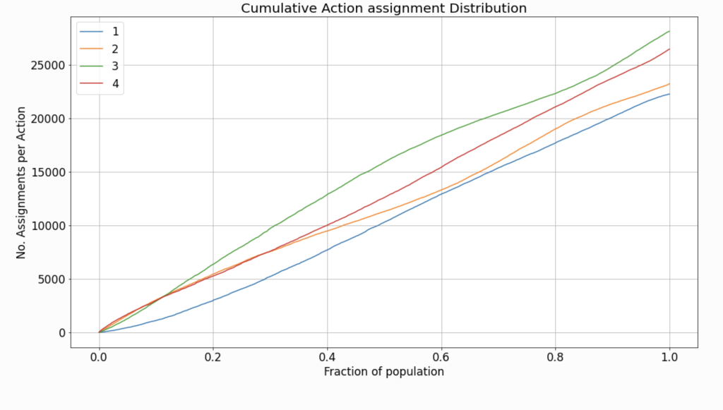
The chart in Figure 1 describes the distribution of treatments according to a naive uplift model, as evaluated on a validation set. The data used both for training and evaluation, in this case, is synthetic. The details of data generation are provided in the tutorial. Because the specification of data generation does not include any preference toward a specific treatment, the assignment rate observed is quite similar, across all treatments. However, in real-life scenarios, the rates might differ greatly between the available treatments.
Note: In cases where only a single non-neutral treatment is considered, this inspection becomes trivial.
treatment assignment according to operating point
In practice, when an uplift model is deployed for assigning treatments to new observations, the score threshold \(Thresh(q^{*},\hat{\boldsymbol{u}}) = p_{q^{*}}\) must be specified. The threshold cannot be computed “on-line” according to inference data, since the model is not guaranteed to be exposed to a distribution of samples. Therefore, the threshold is calculated according to the validation dataset. The chosen threshold is termed the operating point.
Inspecting the assignment distribution under the chosen operating point can also serve as a useful sanity check.
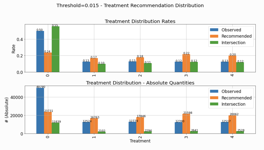
The chart in Figure 2 describes the distribution of assigned treatments across three different groups:
Observed: The actual treatments assigned to the observations composing the evaluated dataset. This distribution is not affected by the choice of the specific threshold.Recommended: The distribution of the recommendations of the policy \(\pi(\boldsymbol{x},q^{*}) = h_{q^{*}}(\boldsymbol{x})\) corresponding to the selected threshold.Intersection: The distribution of actions in the intersection set between the observed actions and the ones recommended by the model, i.e. where the recommendation of the policy \(h_{q^{*}}(\boldsymbol{x})\) goes hand-in-hand with the observed treatment.
The upper subplot describes the density distribution, and the lower describes the distribution in absolute quantities. Thus, the bars associated with the Intersection group in the lower chart (absolute quantities) will always be lower than or equal to the height of the Recommended group.
As explained and demonstrated later in this tutorial, many of the evaluated performance measures rely on the statistics of the Intersections group. Therefore, it is important to verify that the distribution of assignments in the Intersections group is not significantly different from the “hypothetical” distribution of assignments (Recommended). If that is not the case, and the distributions are very different, we won’t be able to “project” the evaluated performance (based on the Intersections group) and expect similar performance when the model is deployed and assigns treatments to new instances.
Performance Assessment
In this section, we describe how to assess the performance of uplift models in offline mode. Offline means that the treatments in the validation dataset, according to which the evaluation is made, are assigned independently of the evaluated model. The performance is described using four charts: uplift curve, fractional lift, gain curve, and expected response curve. Below, we elaborate on these charts in detail.
Offline evaluation is vital to most practical cases, as it allows us to estimate the model’s quality, before performing a test on real live data.
Recall, that the dynamic policy evaluated has a degree-of-freedom in the form of the upper quantile \(q=q^{*} \in (0,1)\), which controls the exposure rate. The model’s performance metrics are all functions of \(q^{*}\). In the described charts, \(q^{*}\) corresponds to the x-axis.
UPLIFT CURVE
The first curve we will use to describe the performance of the uplift model is the uplift curve. This curve (labeled as Intersection Uplift in Figure 3) quantifies the difference between:
- The average response for the group of observations for which the observed actions intersect with the treatments recommended by the model, i.e. \( \mathop{\mathbb{E}} [y_i | \hat{u}_i \geq p_{q^{*}} , h_{q^{*}}(\boldsymbol{x}^{(i)})=t^{(i)} ]\), which is estimated by:
\(\frac{\sum_{i} y_i \mathbb{1}[\hat{u}_i \geq p_{q^{*}}] \cdot \mathbb{1} [h_{q^{*}}(\boldsymbol{x}^{(i)})=t^{(i)} ] }{\sum_{i} \mathbb{1}[\hat{u}_i \geq p_{q^{*}}] \cdot \mathbb{1} [ h_{q^{*}}(\boldsymbol{x}^{(i)})=t^{(i)}] }\)
- The average response for the group of observations which were assigned with the neutral action \(t_0\), i.e. \( \mathop{\mathbb{E}} [y_i | \hat{u}_i \geq p_{q^{*}} , t^{(i)} = t_0 ]\), which is estimated by:
\(\frac{\sum_{i} y_i \mathbb{1}[\hat{u}_i \geq p_{q^{*}}] \cdot \mathbb{1} [t^{(i)} = t_0 ] }{\sum_{i} \mathbb{1}[\hat{u}_i \geq p_{q^{*}}] \cdot \mathbb{1} [ t^{(i)} = t_0 ] }\)
within the acceptance region (as a function of \(q^{*}\)), where \(p_{q^{*}} = Thresh(q^{*},\hat{\boldsymbol{u}}) \). As long as the uplift curve is positive, it implies a higher average response for the intersection group, compared to the untreated group, within the acceptance region. The left edge of the curve describes the difference when a very small fraction of the score distribution is exposed to the recommendations of the model, and the right edge describes a scenario in which the entire population is exposed to the recommendations.
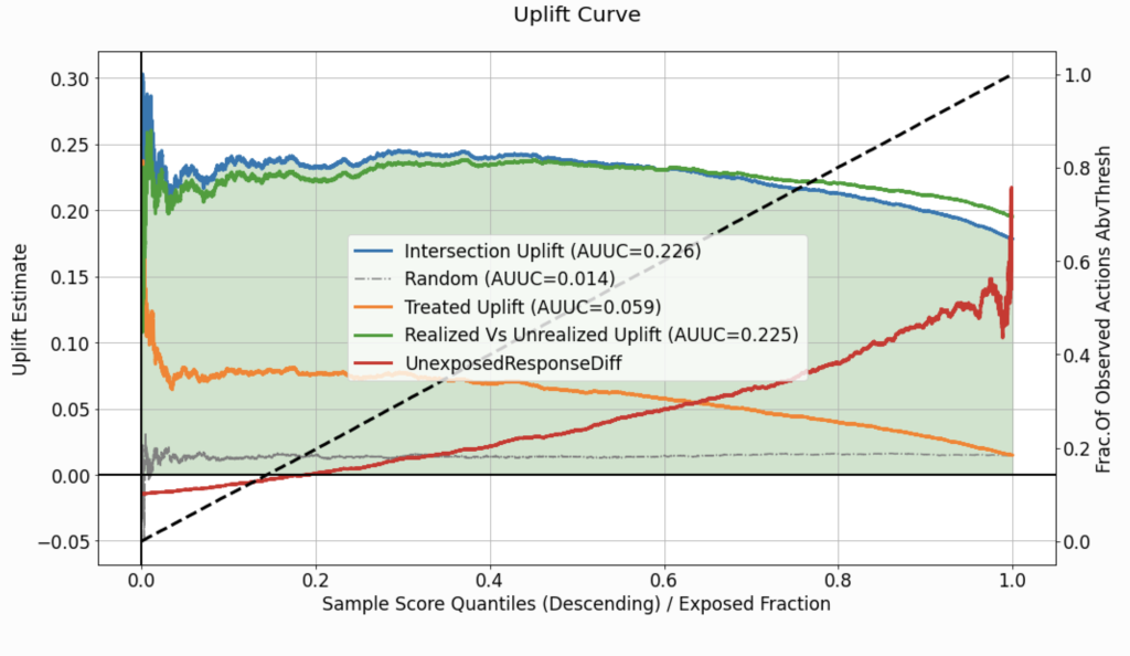
Uplift curves provide a performance measure for every choice of \(q^{*}\). However, such curves cannot be used as an aggregate performance metric. For that purpose, one can compute the Area Under the Uplift Curve (AUUC), which corresponds to the color-filled area in Figure 3. The AUUC value is then used to label the curve on the legend and can serve as an aggregate performance metric.
benchmarking on the fly
To better understand our model’s performance, it would be useful to benchmark it against a naive approach. We would like to validate that our model provides some added value and that its performance is not trivial, given the data’s specific characteristics (e.g. overall average treatment effect). To that end, one can average the performance of multiple “versions” of the dataset, where each version holds a completely random score and treatment assignment, instead of the one suggested by the model. If the model we evaluate performs better than random, its uplift curve should be higher than the curve labeled as Random.
What about the rejection region?
Traditionally, the analysis of uplift models regards response statistics calculated inside the acceptance region, but overlooks the performance in the rejection region. We need to consider the implications of the policy \(h_{q^{*}}\) that intends to assign the neutral treatment \(t_0\) for observations with \(\hat{u}_i <p_{q^{*}}\). To answer that, the curve labeled as UnexposedResponseDiff depicts the difference, in the rejection region, between:
- The average response for the untreated group of observations, i.e. \( \mathop{\mathbb{E}} [y_i | \hat{u}_i < p_{q^{*}} , t^{(i)} = t_0 ]\), estimated by: \(\frac{\sum_{i} y_i \mathbb{1}[\hat{u}_i < p_{q^{*}}] \cdot \mathbb{1} [t^{(i)} = t_0 ] }{\sum_{i} \mathbb{1}[\hat{u}_i < p_{q^{*}}] \cdot \mathbb{1} [ t^{(i)} = t_0 ] }\).
- The average response for the treated (with a non-neutral treatment) group of observations, i.e. \( \mathop{\mathbb{E}} [y_i | \hat{u}_i < p_{q^{*}} , t^{(i)} \neq t_0 ]\), estimated by: \(\frac{\sum_{i} y_i \mathbb{1}[\hat{u}_i < p_{q^{*}}] \cdot \mathbb{1} [t^{(i)} \neq t_0 ] }{\sum_{i} \mathbb{1}[\hat{u}_i < p_{q^{*}}] \cdot \mathbb{1} [ t^{(i)} \neq t_0 ] }\).
for each \(q^{*}\).
When the values of the UnexposedResponseDiff curve are negative for some \(q^{*}\), the average response of the untreated group is lower than that of the treated one. It means that the model will “lose” w.r.t response statistics by abstaining from treating instances in this region.
SCORE DISTRIBUTION SIMILARITY
The dashed black line in Figure 3, corresponds to the right y-axis, and it displays the proportion of the treated observations (\(t^{(i)} \neq t_0\)), found inside the acceptance region, for each \(q^{*}\). Thus, it will always range from zero (where the acceptance region width is negligible) to one (where the acceptance region is spread over the entire distribution of scores).
When the black dashed line shifts up from zero to one in a linear fashion, it implies that the uplift scores for the treated group are distributed similarly to those of the entire population.
On the other hand, if the same line moves upwards in a non-linear fashion, it implies that the distribution of scores associated with the treated group differs from that of the entire population. For example, if the uplift scores for the treated instances are generally higher than the scores for the non-treated ones, it might indicate a leakage of information related to the treatment assignment into the model, as the model should output scores regardless of the assigned and recorded treatment (as found in the observational data). In addition, it might indicate that the assignment of treatments during the controlled randomized experiment (yielding the data) was not necessarily completely random and that observations with certain characteristics (expressed in their covariates) tend to get treated more often. This aspect of randomized data collection process control is also crucial to our ability to draw conclusions from the evaluation.
multi-treatment use cases
Two more curves, displayed in Figure 3, are worth inspecting. They are labeled as Treated Uplift and Realized Vs Unrealized Uplift. These curves are only relevant if the evaluated dataset is associated with multiple actions. When the treatment is binary (a single non-neutral action), both of these curves will be identical to the Intersection Uplift curve.
Treated Uplift describes a scenario in which all the non-neutral actions, \(t \neq t_0\), are treated as a single treatment and quantifies the associated uplift, i.e. \( \mathop{\mathbb{E}} [y_i | \hat{u}_i \geq p_{q^{*}} , t^{(i)} \neq t_0] – \mathop{\mathbb{E}} [y_i | \hat{u}_i \geq p_{q^{*}} , t^{(i)} = t_0]\), estimated by:
\(\frac{\sum_{i} y_i \mathbb{1}[\hat{u}_i \geq p_{q^{*}}] \cdot \mathbb{1} [t^{(i)} \neq t_0 ] }{\sum_{i} \mathbb{1}[\hat{u}_i \geq p_{q^{*}}] \cdot \mathbb{1} [ t^{(i)} \neq t_0 ] } – \frac{\sum_{i} y_i \mathbb{1}[\hat{u}_i \geq p_{q^{*}}] \cdot \mathbb{1} [t^{(i)} = t_0 ] }{\sum_{i} \mathbb{1}[\hat{u}_i \geq p_{q^{*}}] \cdot \mathbb{1} [ t^{(i)} = t_0 ] } \)
In a multi-treatment scenario, the gap between this curve and the Intersection Uplift curve can be used to justify (or refute) the need to consider each treatment separately, instead of using the model just to map which instances to treat, with the treatments being chosen randomly for these instances. As the gap between the curves grows bigger (for the benefit of the Intersection Uplift curve), the advantage of using a multi-treatment approach becomes more evident.
Realized Vs Unrealized Uplift describes the difference in average response between the intersection set, where the recommendation of the model matches the observed action assigned, and the complement set– where the recommended action by the model is different from the one assigned during the collection of data. This difference, \( \mathop{\mathbb{E}} [y_i | \hat{u}_i \geq p_{q^{*}} , h_{q^{*}}(\boldsymbol{x}^{(i)}) = t^{(i)}] – \mathop{\mathbb{E}} [y_i | \hat{u}_i \geq p_{q^{*}} , h_{q^{*}}(\boldsymbol{x}^{(i)}) \neq t^{(i)}]\), is estimated by:
\(\frac{\sum_{i} y_i \mathbb{1}[\hat{u}_i \geq p_{q^{*}}] \cdot \mathbb{1} [h_{q^{*}}(\boldsymbol{x}^{(i)}) = t^{(i)}] }{\sum_{i} \mathbb{1}[\hat{u}_i \geq p_{q^{*}}] \cdot \mathbb{1} [ h_{q^{*}}(\boldsymbol{x}^{(i)}) = t^{(i)}] } – \frac{\sum_{i} y_i \mathbb{1}[\hat{u}_i \geq p_{q^{*}}] \cdot \mathbb{1} [h_{q^{*}}(\boldsymbol{x}^{(i)}) \neq t^{(i)}] }{\sum_{i} \mathbb{1}[\hat{u}_i \geq p_{q^{*}}] \cdot \mathbb{1} [ h_{q^{*}}(\boldsymbol{x}^{(i)}) \neq t^{(i)}] }\)
Such a difference can also be used to assess the benefit from learning to select the optimal treatment to assign to each instance, over the naive approach according to which all treatments are simply considered as a single treatment.
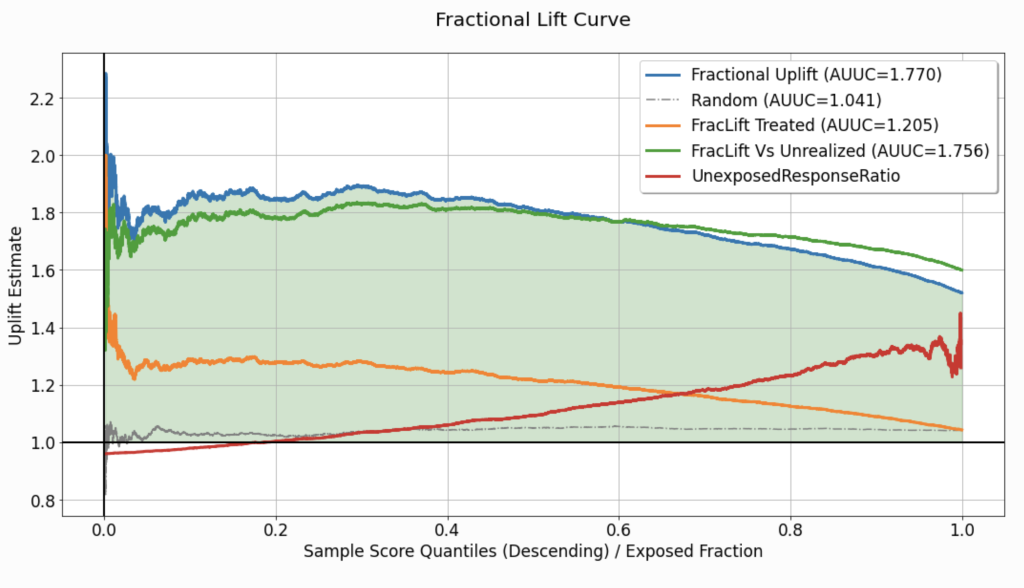
Fractional Lift
In some use-cases, especially when the response variable is continuous, merely reporting the difference in average response between groups might limit our ability to interpret the potential for improvement the model has to offer. In such cases, reporting one group’s average response increase (as a percentage), as compared to another, can be more useful. The fractional lift chart (Figure 4) enables the visualization of average response ratios, which reflect the percentage increase/decrease associated with treatment assignment (or the lack thereof).
This chart replaces the subtraction operation used to calculate the curves depicted in the uplift chart, and computes the ratio of average responses between the same “confronted” groups. Thus, qualitatively, it is similar to the corresponding uplift chart (Figure 3), but the values associated with the curves (y-axis) are not expressed in the same units as the response variable. For a detailed explanation of the quantities used to compute every curve in this chart, refer to the explanation of the uplift chart.
GAIN CURVE
We define gain as the absolute quantitative result/benefit implied by the calculated uplift for the evaluated dataset. Let us assume that the estimate of the uplift signal is reliable, and denote by \(N_{t_0}(q^{*})\) the number of untreated instances falling inside the acceptance region (corresponding to \(q^{*}\)). If we were to apply the uplift model using the threshold \(Thresh \left( q^{*},\hat{\boldsymbol{u}} \right) \) on the same specific evaluated dataset, the question answered by the gain metric would be:
- How many instances can we expect to change their response from \(0\) to \(1\)? (for a binary response variable)
- What would the total increase in the response for these \(N_{t_0}(q^{*})\) instances be, if they were exposed to the recommendations of the model? (for a continuous response variable)
To calculate the gain, we multiply the uplift signal (estimated and shown in the uplift chart) by the number of untreated instances, for each \(q^{*}\), and the corresponding threshold \(Thresh \left(q^{*},\hat{\boldsymbol{u}} \right) = p_{q^{*}}\):
\(Gain\left(q^{*}\right) = \left(\frac{\sum_{i} y_i \mathbb{1}\left[\hat{u}_i \geq p_{q^{*}}\right] \cdot \mathbb{1} \left[h_{q^{*}}\left(\boldsymbol{x}^{(i)}\right)=t^{(i)} \right] }{\sum_{i} \mathbb{1} \left[\hat{u}_i \geq p_{q^{*}}\right] \cdot \mathbb{1} \left[ h_{q^{*}} \left(\boldsymbol{x}^{(i)} \right) = t^{(i)} \right] } – \frac{\sum_{i} y_i \mathbb{1} \left[\hat{u}_i \geq p_{q^{*}} \right] \cdot \mathbb{1} \left[t^{(i)} = t_0 \right] }{\sum_{i} \mathbb{1} \left[\hat{u}_i \geq p_{q^{*}} \right] \cdot \mathbb{1} \left[ t^{(i)} = t_0 \right] } \right) \cdot \left( \sum_{i} \mathbb{1} \left[\hat{u}_i \geq p_{q^{*}} \right] \cdot \mathbb{1} \left[t^{(i)} = t_0 \right] \right)= Uplift \left(q^{*} \right) \cdot N_{t_0} \left(q^{*} \right) \)
An example of a gain curve is provided in Figure 5. Although in this specific case, the curve seems to rise almost for the entire range of \(q^{*}\), in other practical scenarios, this curve might be shaped differently.
For example, if the uplift curve is descending but positive, as a function of \(q^{*}\), then although \(N_{t_0} \left(q^{*} \right)\) is monotonically increasing w.r.t \(q^{*}\), the decrease in the uplift signal might yield a bell-shaped gain curve.
Should we wish to reduce the gain curve to a single scalar, the maximal gain calculated can be used as an aggregate performance metric, similar to the AUUC. This is where the selection of the operating point comes into the picture. One might choose to assign the operating point a threshold corresponding to the maximal gain (highlighted and labeled as part of the chart).
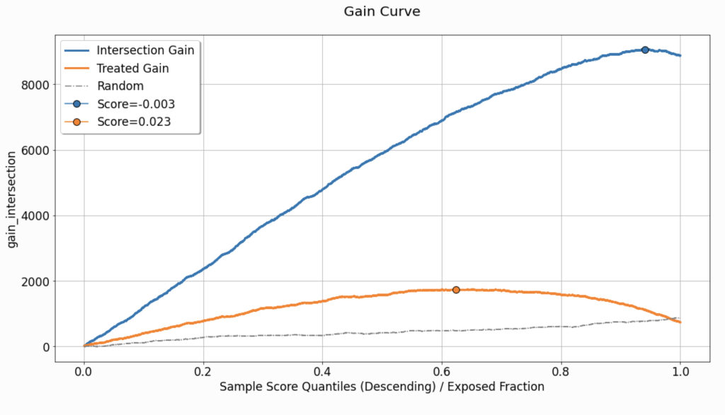
As for the previous curves, benchmarking using the average of randomly-scored evaluation sets can be useful for understanding whether the gain observed in our primary evaluated set is coincidental or not.
The curve labeled as Treated Gain only adds information in the event that the evaluated set is associated with multiple treatments. It describes and quantifies the gain associated with a scenario in which all the non-neutral actions, \(t \neq t_0\), are treated as a single treatment. Just like in the uplift chart, the gap between Intersection Gain and Treated Gain, can emphasize the need to consider each treatment separately.
expected response
Although the analysis of uplift models focuses primarily on statistics computed inside the acceptance region, what we would like to eventually achieve is a model (and a corresponding operating point) that maximizes the expected value of the response variable for the entire population. For this purpose, we assume that the distribution of uplift scores and response values observed in the evaluated dataset provides a good representation of the distribution the model will meet upon deployment.
In such a case, the expected response can be viewed as a weighted average of two factors:
- The average response for the group of observations for which the observed actions intersect with the treatments recommended by the model, in the acceptance region: \(\frac{\sum_{i} y_i \mathbb{1}\left[\hat{u}_i \geq p_{q^{*}}\right] \cdot \mathbb{1} \left[h_{q^{*}}\left(\boldsymbol{x}^{(i)}\right)=t^{(i)} \right] }{\sum_{i} \mathbb{1} \left[\hat{u}_i \geq p_{q^{*}}\right] \cdot \mathbb{1} \left[ h_{q^{*}} \left(\boldsymbol{x}^{(i)} \right) = t^{(i)} \right] }\). On Figure 6 this curve is labeled as
AvgResponseIntersectedTreatments. - The average response for the untreated group of observations, which fall in the rejection region: \(\frac{\sum_{i} y_i \mathbb{1}\left[\hat{u}_i < p_{q^{*}}\right] \cdot \mathbb{1} \left[ t^{(i)} = t_0 \right] }{\sum_{i} \mathbb{1} \left[\hat{u}_i < p_{q^{*}}\right] \cdot \mathbb{1} \left[ t^{(i)} = t_0 \right] }\). This curve is labeled as
AvgResponseUntreated.
To represent the uncertainty associated with the estimation of the average response when calculating these curves, uncertainty sleeves can be employed. In Figure 6, we use these sleeves to represent a \(95 \%\) confidence interval associated with the standard error of either the mean estimator (when the response variable is continuous) or the proportion estimator (when the response variable is binary).
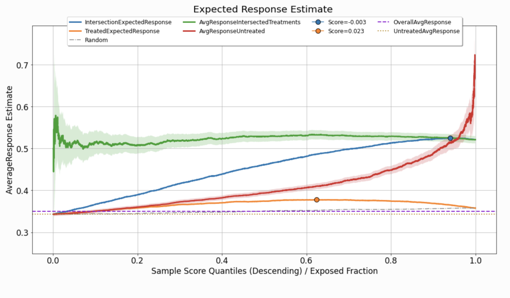
To estimate the expected response associated with the policy \(h_{q^{*}}\left(\boldsymbol{x}^{(i)}\right)\) based on our evaluated dataset, we weigh these two curves as follows:
\(q^{*} \cdot AvgResponseIntersectedTreatments \left( q^{*}\right) + \left( 1 – q^{*} \right) \cdot AvgResponseUntreated \left( q^{*} \right)\)
As this curve considers the aggregation of the model’s performance across the entire distribution of scores, and, just like the gain curve, it might not (and probably won’t) be monotonically increasing, it can also be used to set the optimal operating point.
Since the expected response is specified in the same units as the response variable we wish to maximize, there are two values that can serve as a useful reference:
- The average response observed across the entire evaluated dataset (labeled as
OverallAvgResponse). - The average response observed across the untreated group in the evaluated dataset (labeled as
UntreatedAvgResponse).
Both of these are fixed values; they are not affected by specific choices of the operating point.
In addition, except for benchmarking against randomly-scored sets, in multi-treatment use cases, the expected response curve can be compared against the curve labeled in Figure 6 as TreatedExpectedResponse. The calculation of this curve applies the same logic as in the computation of IntersectionExpectedResponse, but considers all the non-neutral treatments as a single action.
Acceptance-REGION and Rejection-Region Statistics
Recall that the uplift signals depicted in the uplift chart are subtractions of mean/proportion estimators of the response in the acceptance region. Therefore it could be useful to examine these source signals directly.
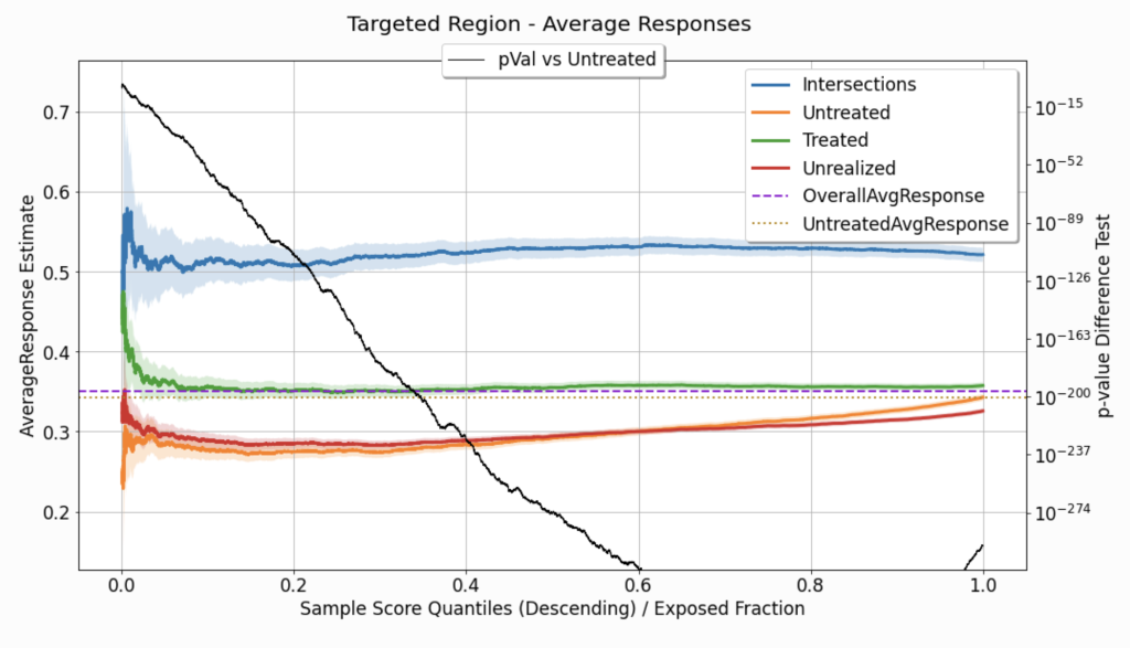
Figure 7 depicts a few mean/proportion estimate signals, as a function of \(q^{*}\). All of these are computed for observations with \(\hat{u}_i \geq Thresh \left( q^{*},\hat{\boldsymbol{u}} \right) \):
Intersections: where \(h_{q^{*}}\left(\boldsymbol{x}^{(i)}\right)=t^{(i)}\).Untreated: where \(t^{\left( i \right)} = t_0 \).Treated: where \(t^{\left( i \right)} \neq t_0 \) (relevant only in multi-treatment use cases).Unrealized: where \(t^{\left( i \right)} \neq h_{q^{*}}\left(\boldsymbol{x}^{(i)}\right) \) (relevant only in multi-treatment use cases).
As all these signals are used to estimate mean response or response proportion (depending on the type of the response variable), for each \( q^{*}\), describing the uncertainty associated with them can be useful. In Figure 7, we use uncertainty sleeves to depict a \(95 \%\) confidence interval associated with the corresponding standard error. As we move along the curves towards the right side of the chart, the acceptance region goes wider, and the estimators rely on more observations, the uncertainty decreases, and the sleeves go narrower.
Recall that the uplift signals quantify the differences between the curves listed above. However, the reliability (or uncertainty) associated with the estimations that these curves represent varies w.r.t to \( q^{*}\). Thus, we can use statistical hypothesis testing to assess the differences in average response. More precisely, we can examine the difference between the Intersections group and the Untreated group. The null hypothesis used for this test is that the average response for the two groups is equal, while the alternative hypothesis is that it is different (a two-tailed test). When the response variable is continuous, a t-test is used to test the difference in means; when the response variable is binary, a proportion test is used.
As a result of the performed test, for each \( q^{*}\), we get a corresponding p-value, which quantifies the probability of observing findings as extreme as the acquired statistics, in case the null hypothesis is true. The p-value associated with each \( q^{*}\) is depicted in Figure 7 (associated with the right y-axis); as it decreases, it implies that the difference between the estimators is more significant.
To obtain a complete picture, one can also examine the estimators of average response in the rejection region:
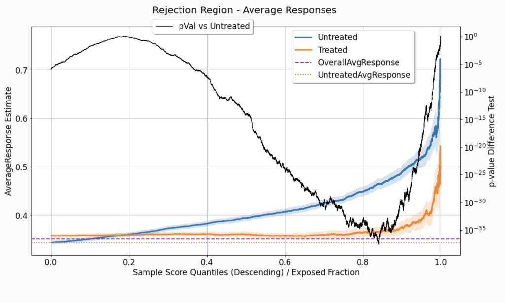
Figure 8 displays two mean/proportion estimate signals, as a function of \( q^{*}\). Both signals are computed to tabulate observations in the rejection region , where \(\hat{u}_i < Thresh \left( q^{*},\hat{\boldsymbol{u}} \right) \):
Untreated: where \(t^{\left( i \right)} = t_0 \).Treated: where \(t^{\left( i \right)} \neq t_0 \).
As opposed to the chart depicting the statistics in the acceptance region (Figure 7), here, the uncertainty sleeves widen as we consider higher \( q^{*}\) values. This is because a higher \( q^{*}\) value implies a narrower rejection region, so these estimates end up relying on fewer observations.
Agreement Statistics
As explained earlier, our ability to interpolate the observed tuples structured as \(\left(context, treatment, response \right)\), and estimate the response for an unseen combination of \(context\) and \(treatment\), depends, in part, on the controlled randomization during the data collection phase.
The evaluated performance displayed in the charts above relies heavily on the instances for which the model’s recommendation matches the treatment assigned during the data collection phase. If these intersections occur at significantly different rates along with the distribution of uplift scores, it might imply that:
- The assignment of treatments was not completely random – some information, available also to the model, affected the probability of treatment assignment, at the observation level.
- Leakage of treatment-assignment-related information found its way, through the covariates, to the model, affecting the distribution of uplift scores, within the treated group.
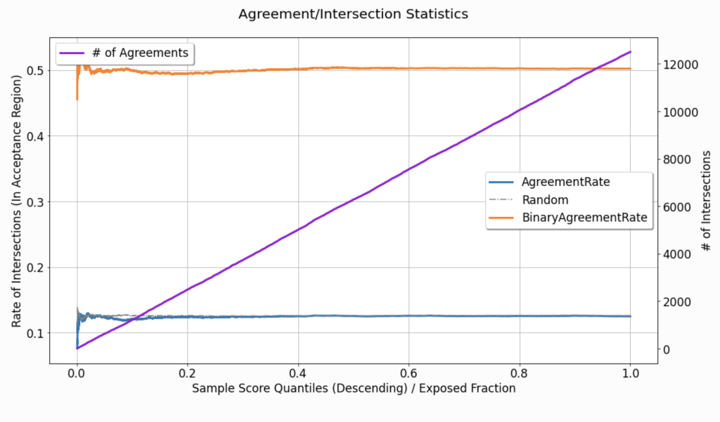
In Figure 9, the curve labeled as AgreementRate depicts the rate at which these agreements / intersections occur as a function of the acceptance region’s width (as controlled by \( q^{*}\)):
\(\frac{1}{N_{q^{*}}} \sum_{i} \mathbb{1} \left[ \hat{u}_i \geq Thresh \left( q^{*}, \hat{\boldsymbol{u}} \right) \right] \cdot \mathbb{1} \left[ h_{ q^{*}} \left( \boldsymbol{x}^{(i)} \right) = t^{(i)} \right] \)
where \(N_{q^{*}}\) denotes the total quantity of observations in the acceptance region. In the displayed curve, the rate seems to be almost perfectly uniform w.r.t to \( q^{*}\) (except for the noise in the narrow acceptance region, which is associated with smaller \( q^{*}\) values). The dataset used to create this specific visualization is synthetic (see the tutorial for additional details), and in its generation, we can easily control the randomization of treatment assignment. However, in practice, this is not always the case, and such visualizations can be used to point out imperfections in the randomization of treatments assignment.
The # of Agreements curve from Figure 9(corresponding to the right y-axis), describes the cumulative count of agreements found, as \( q^{*}\) increases. Non-linear growth of this monotonically increasing curve might also imply the same leakage or imperfect randomization as mentioned above.
comparison and averaging
Sometimes, comparing multiple uplift evaluations is desired, or even required. The multiple evaluations may correspond to different modeling strategies, a single modeling technique trained on different training sets, or even the same trained model evaluated on different validation sets.
In other cases, we might want to average the performance of our uplift modeling approach across multiple evaluations, in order to gain a better and broader understanding of the expected performance of the discussed approach. Here, for example, multiple evaluations may correspond with runs with different random seeds when the data is noisy, or to different validation sets that span different periods along time.
uplift-analysis provides a friendly interface for generating such comparisons or averaging, across multiple evaluations. For further demonstrations, check out the accompanying tutorial.
Wrapping up
This blog post overviews the evaluation and analysis of uplift models’ performance. It provides a formal description of uplift modeling problems and the challenges they pose. In addition, it suggests how to approach the analysis of uplift models, presents evaluation methods, elaborates on practical considerations, and highlights concepts that are often overlooked, when uplift models are traditionally evaluated.
References
- Olaya, D., Coussement, K., & Verbeke, W. (2020). A survey and benchmarking study of multitreatment uplift modeling. Data Mining and Knowledge Discovery, 34(2), 273-308.
- Zhao, Y., Fang, X., & Simchi-Levi, D. (2017). Uplift Modeling with Multiple Treatments and General Response Types. ArXiv, abs/1705.08492.
- Zhao, Z., & Harinen, T. (2019). Uplift Modeling for Multiple Treatments with Cost Optimization. 2019 IEEE International Conference on Data Science and Advanced Analytics (DSAA), 422-431..
- Gutierrez, P., & Gérardy, J. (2016). Causal Inference and Uplift Modelling: A Review of the Literature. PAPIs.
- Nie, X., & Wager, S. (2017). Quasi-oracle estimation of heterogeneous treatment effects. arXiv: Machine Learning.
- Alaa, A.M., & Schaar, M.V. (2018). Limits of Estimating Heterogeneous Treatment Effects: Guidelines for Practical Algorithm Design. ICML.